Shaping Hootsuite's new branding with Deck of Truth redesigned
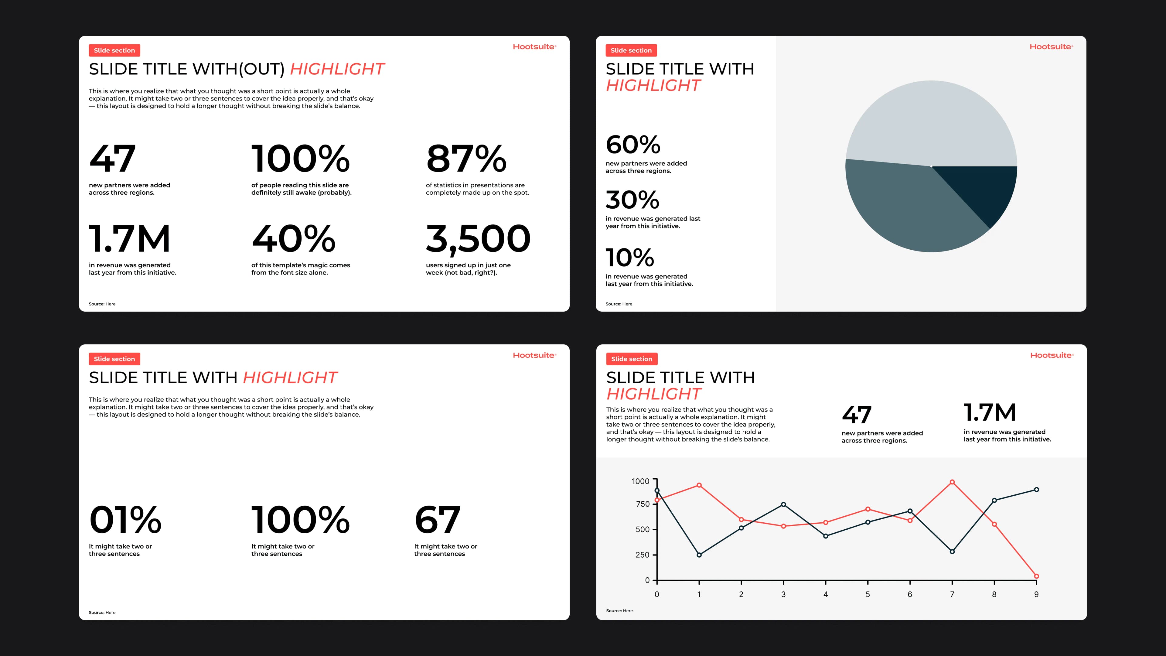
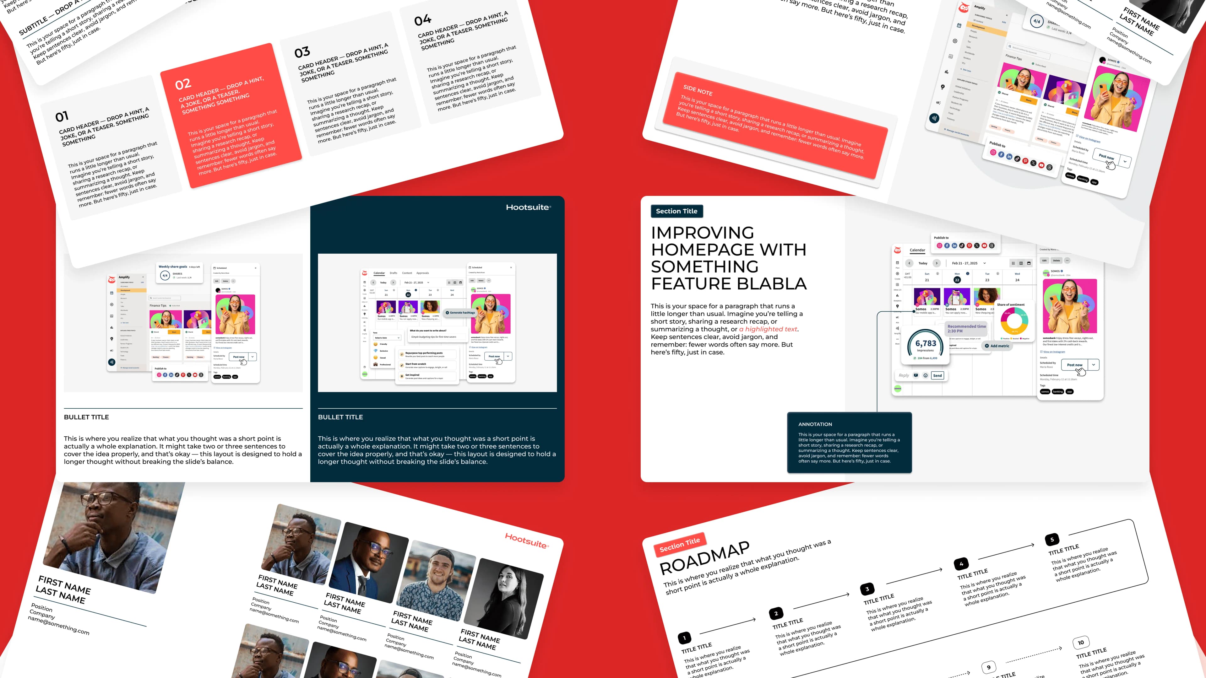
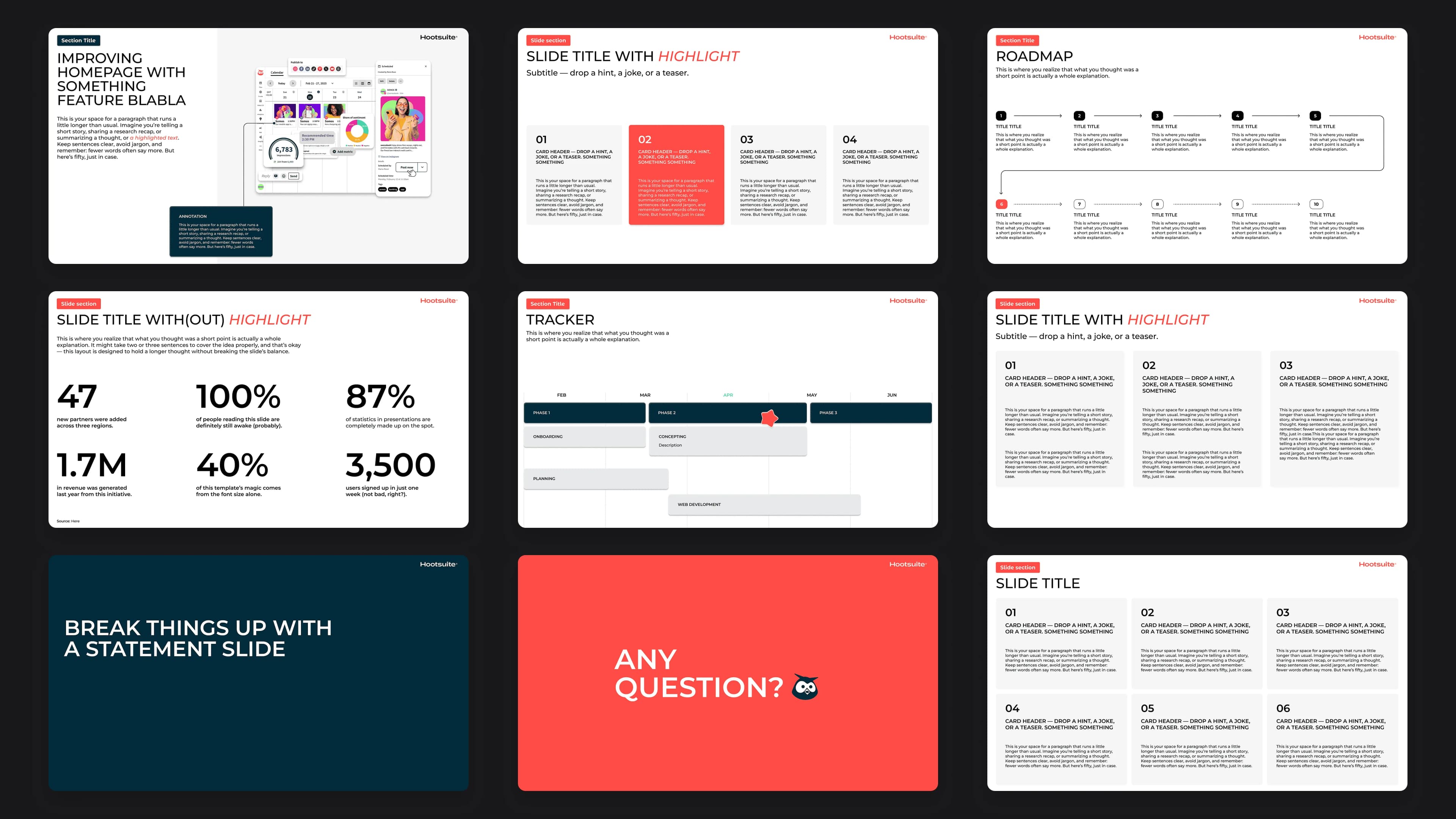
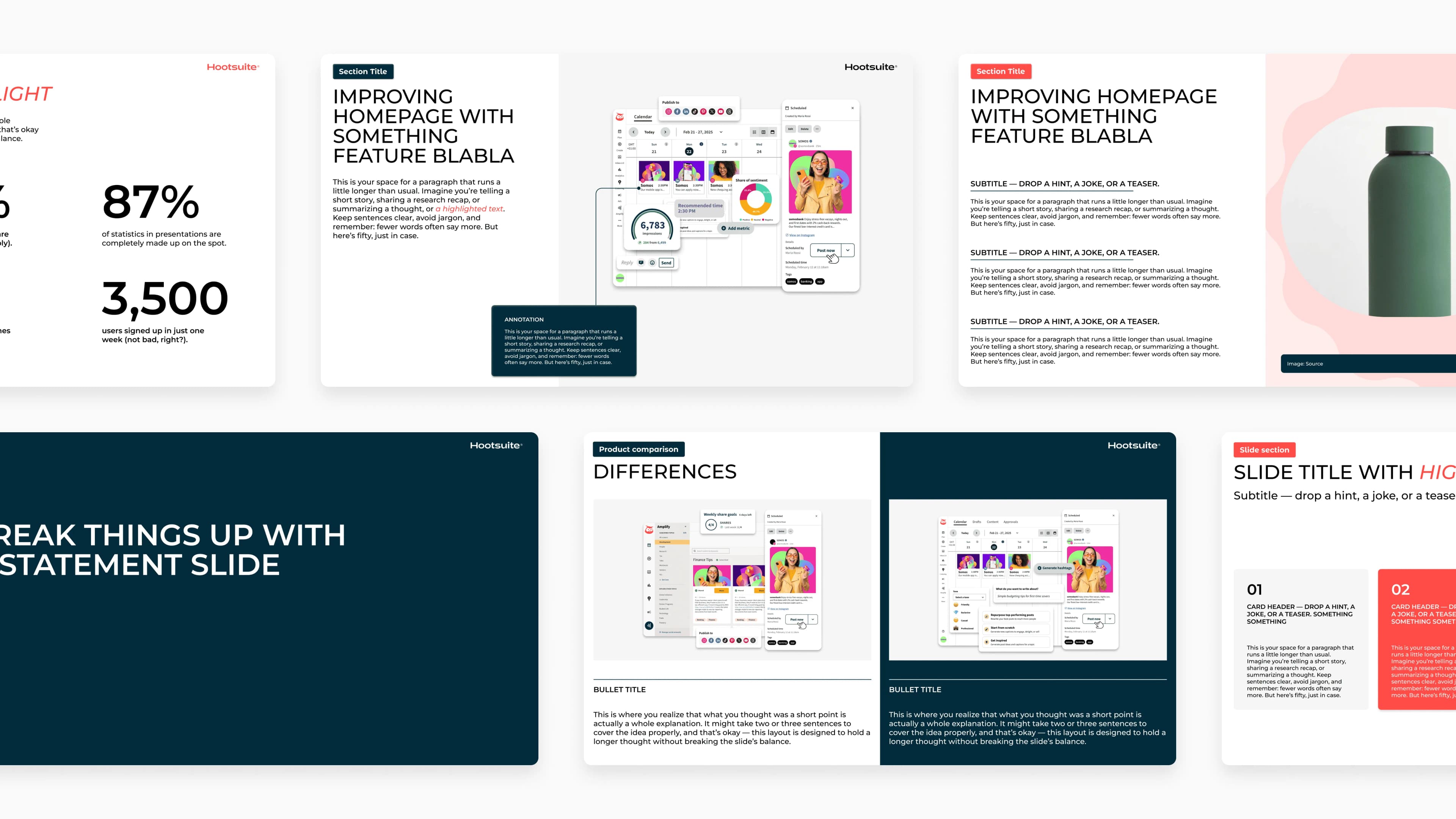
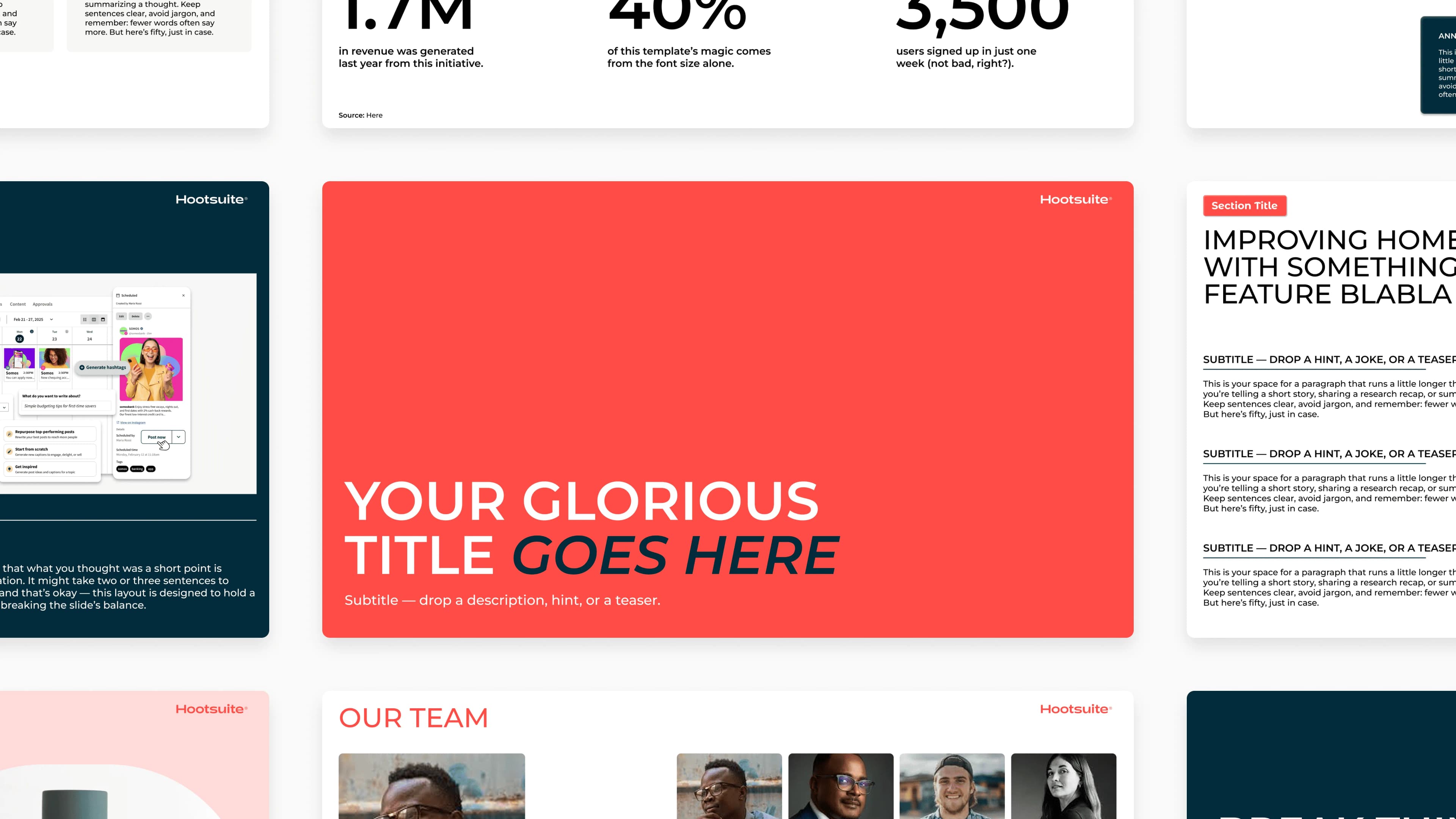
In September 2025, I spent one month with the brand marketing team auditing the current branding, and proposing a new direction to help shift Hootsuite's brand from social to enterprise. My work was first introduced as a presentation slide deck template, reflecting updated typography, colour, and layout composition that looks modern and enterprise-ready, aligned with the 2026 direction. This deck template was adopted internally across all departments.
Result
Typography and colour system carried into the 2026 brand.
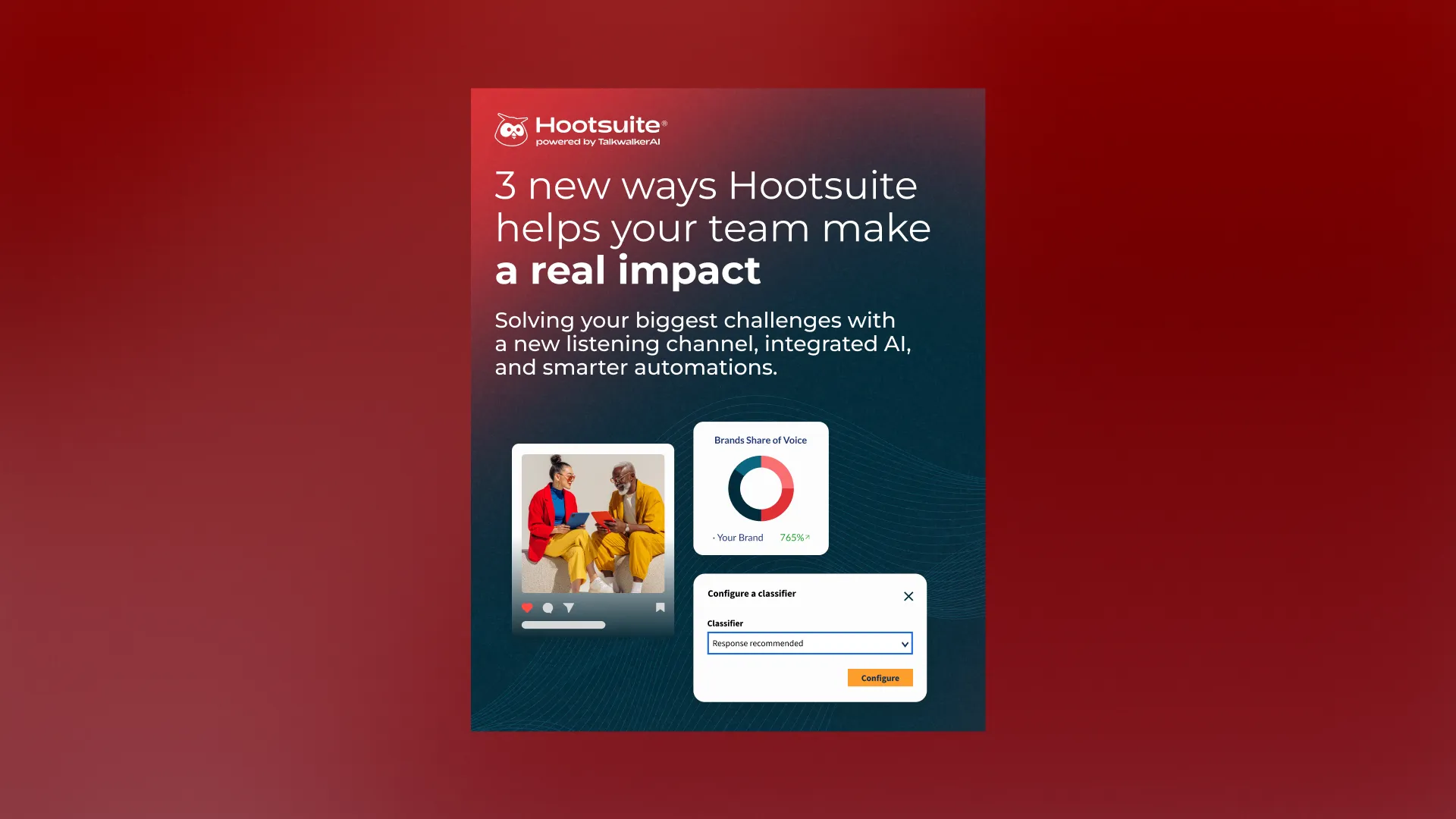
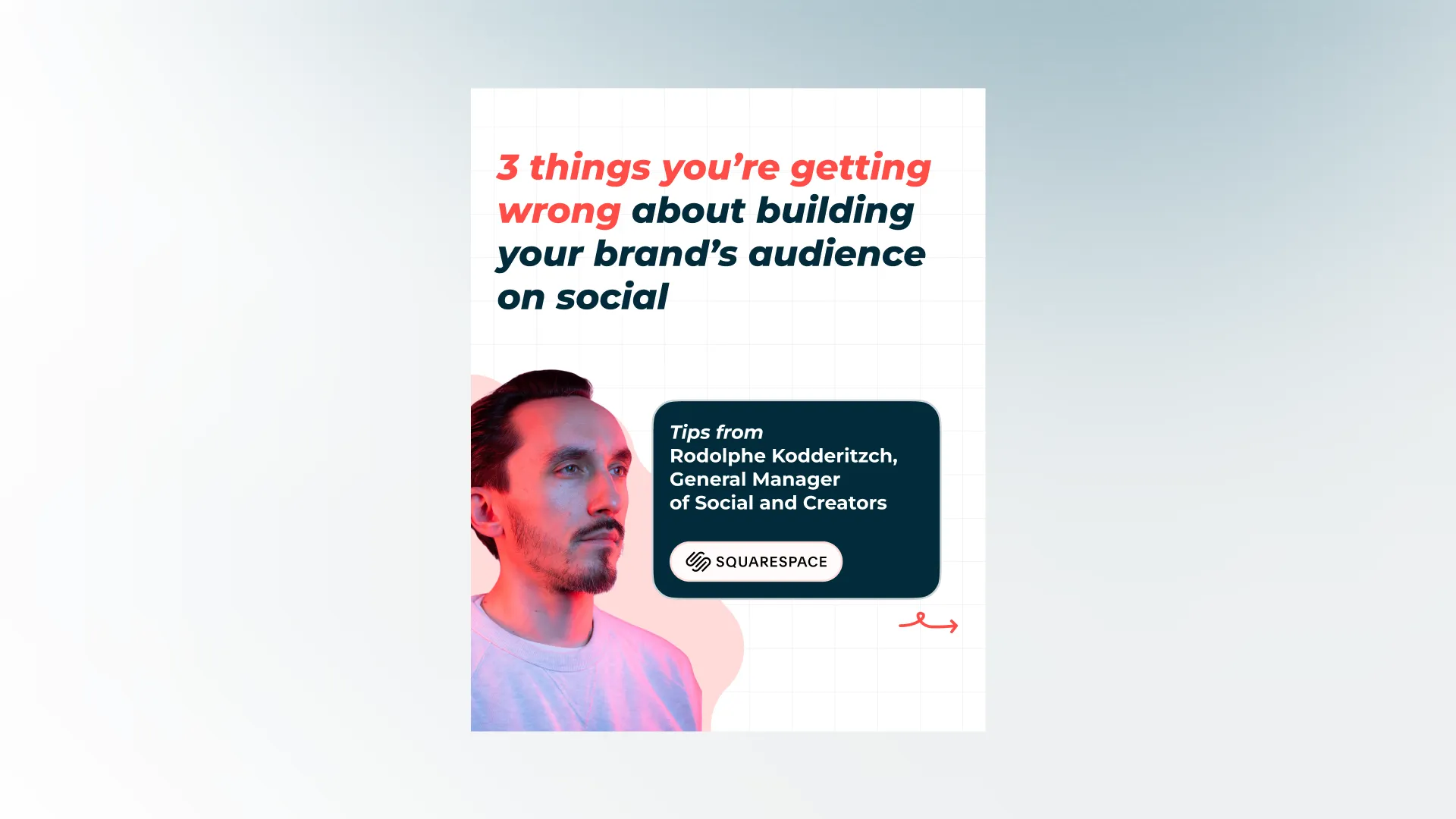
A lot of my work carried into 2026, the typography treatment and gradient colour system became part of the live brand, used to complement content in the foreground. Below is one example of a recent Q1 product update on Hootsuite's Instagram reflecting the new brand direction: shifting from a social to an enterprise look and feel, with attention to background colour gradient, mature and consistent typography, and professional image choices.
Learning
Designed with research-backed decision helps me work with confidence.
Working in graphic design with a research-first process taught me that validating decisions through others' expertise saves testing time. Going in with research-backed choices gave me the confidence to design knowing the quality I was working with could actually hold up.
Check out my highlight below or view the presentation for full proposal!
Testimonial
Some kind words from my manager.
Duc consistently exceeded expectations for a co-op student. He ramped up quickly, produced high-quality, on-brand design work, and required very few rounds of revision. He worked independently, was reliable, and showed maturity and ownership closer to a junior designer than a student.
Anne Buchan, Interim Design Team Lead