work

Collaborative Trip Planning

In 3 weeks, I led the user research, wireframes, and prototype for a new Airbnb feature that lets groups collaborate on finding and booking a place to stay inside the app. I worked with a UX researcher and two UX designers.

Collaborative Trip Planning — cover
TeamDuc Ngo (Product Designer), Kelvin Kwan (UX Researcher), Sarah Luong (UX Designer), Hazel Hau (UX Designer)
SkillsUX Research, User Interface Design, Prototyping
DurationFebruary 2026 (3 weeks)

How it started

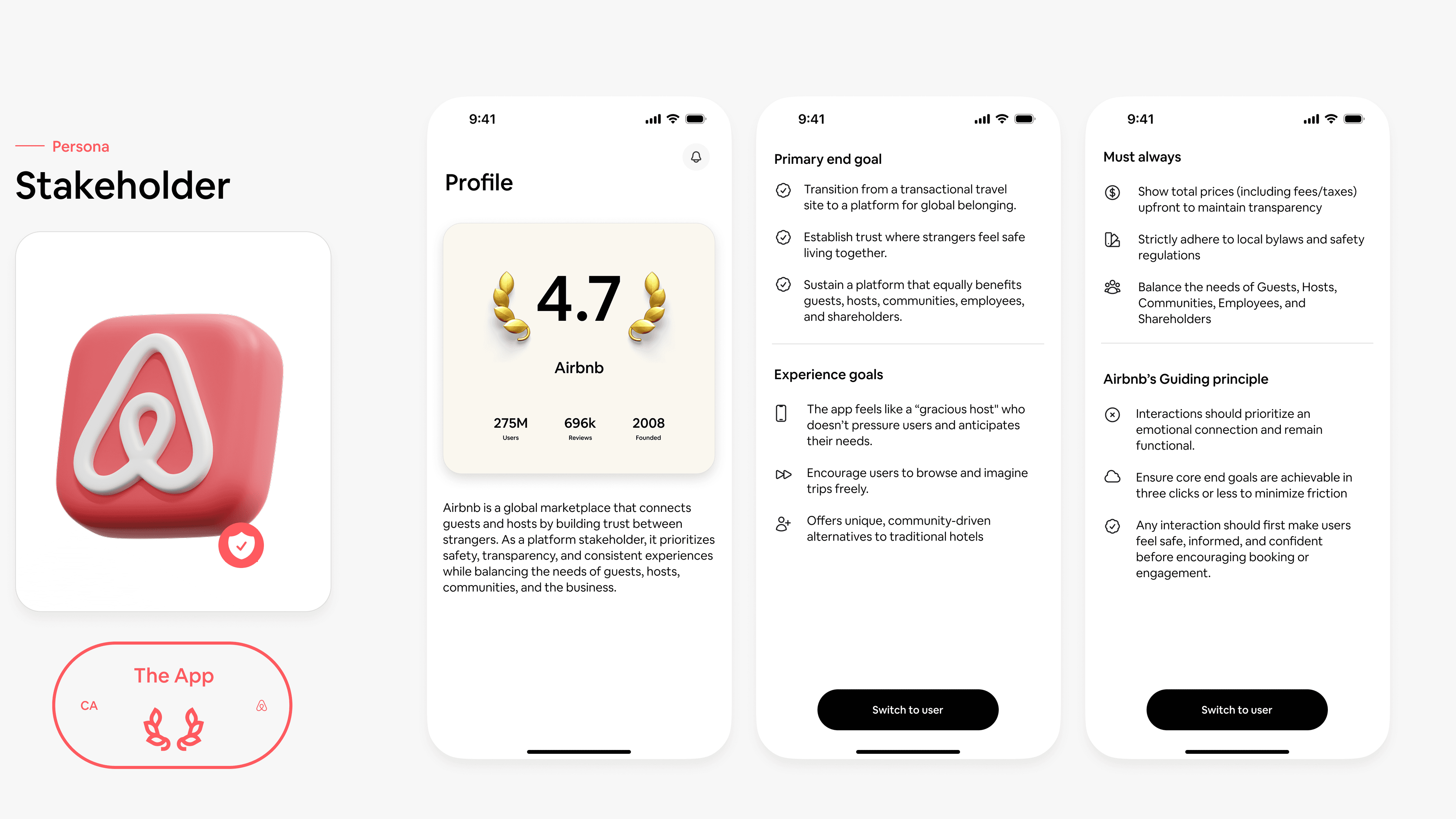
Studied Airbnb's business and product

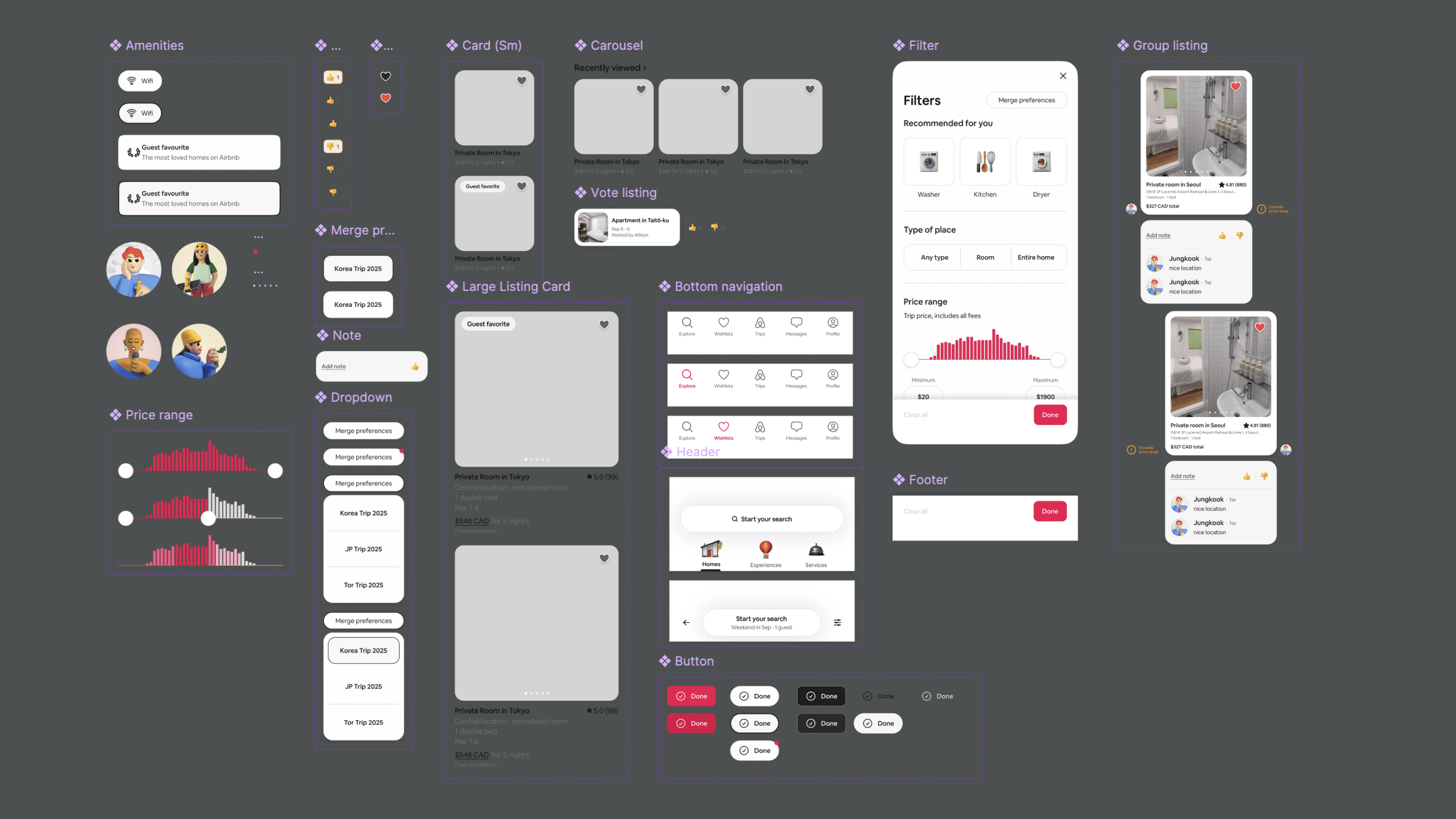
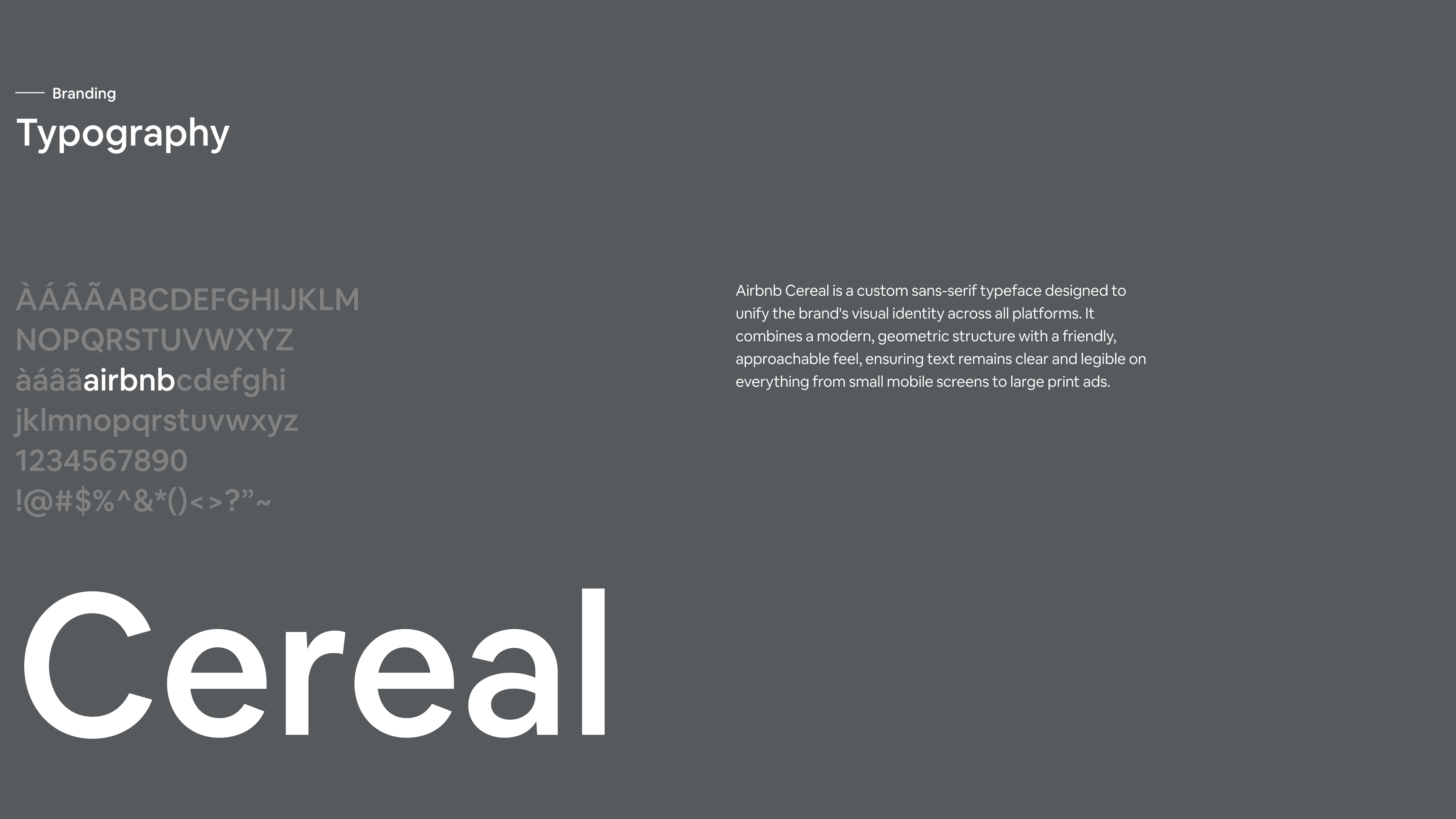
To kickoff, we researched on Airbnb's business to understand their goal and principles. We also studied their branding and design system to get everyone in the team onboarded. In this step, I recreated their design system on Figma to help the team learn and apply it to wireframes efficiently.

How it started
Airbnb design system study — slide 1
Airbnb design system study — slide 2

Primary research

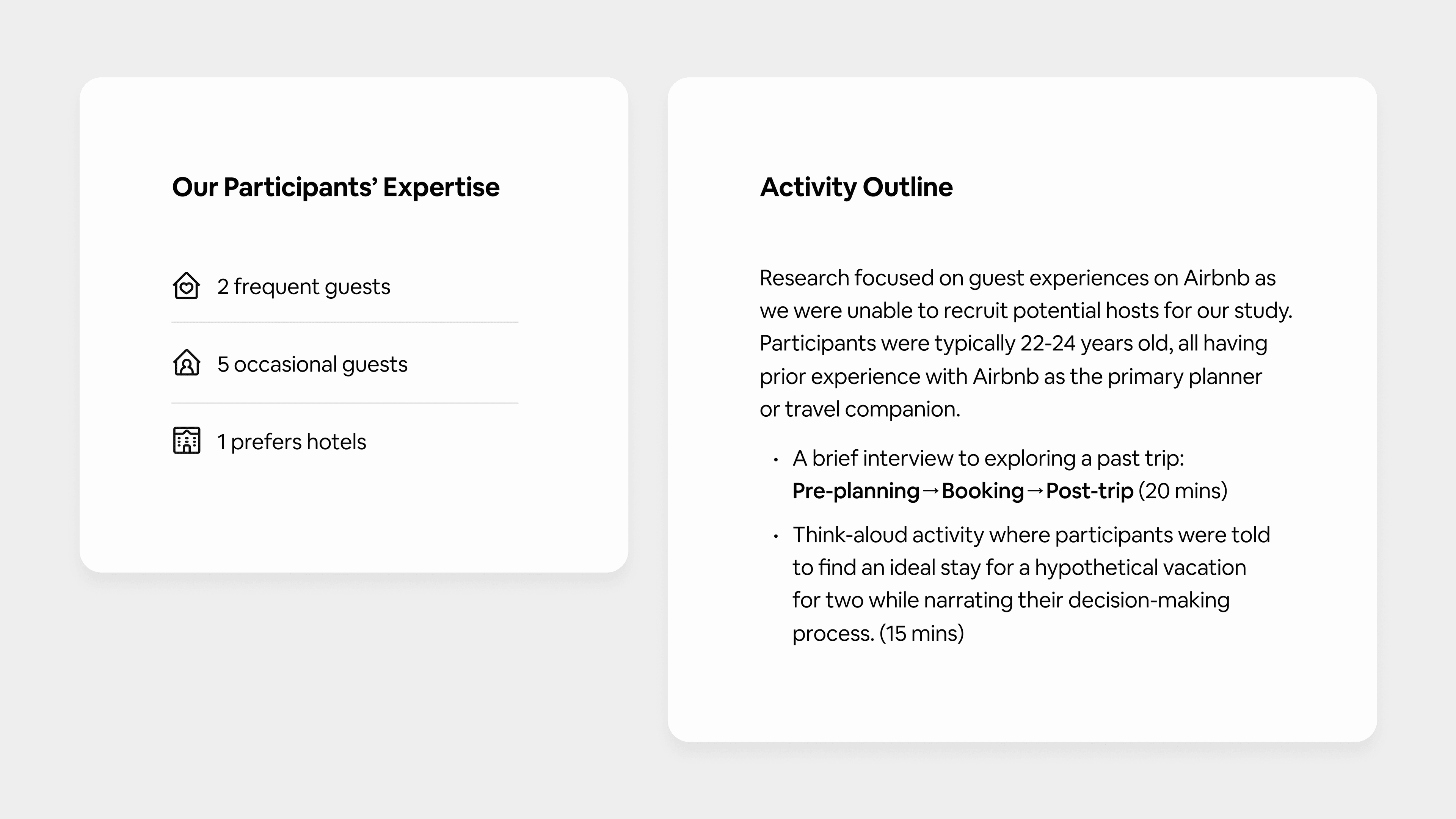
Interviewed Airbnb's users about travel experience

While Airbnb has years to develop their features and user experience, with curiosity on what we can do to improve even more on their products, we chose direct interview with both new and experienced guests and hosts. We focus on their whole trip experience rather than the app itself to learn about their behaviour while travel.
Primary research

Our focus

User Preferences

What criteria do users prioritize when choosing accommodations (e.g., price, location, reliability)?

Social Dynamics

How do users naturally plan and make decisions when traveling with others?

Interaction Patterns

How do users navigate Airbnb's search and filter tools to narrow down options?

Trust & Mental Models

How does the interface communicate trust and quality, and how do users interpret these signals?

Research synthesis

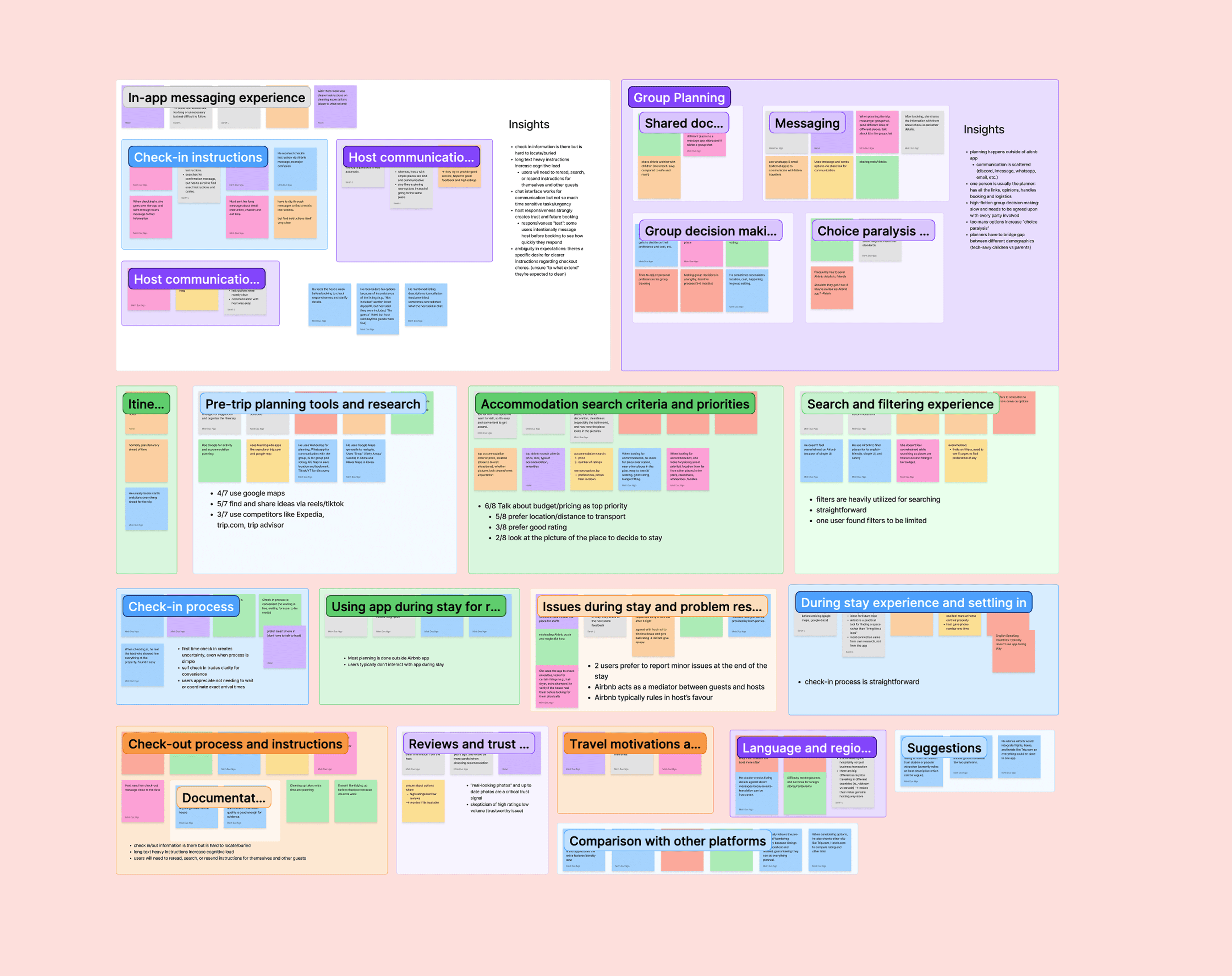
Navigated through rich data to find common themes

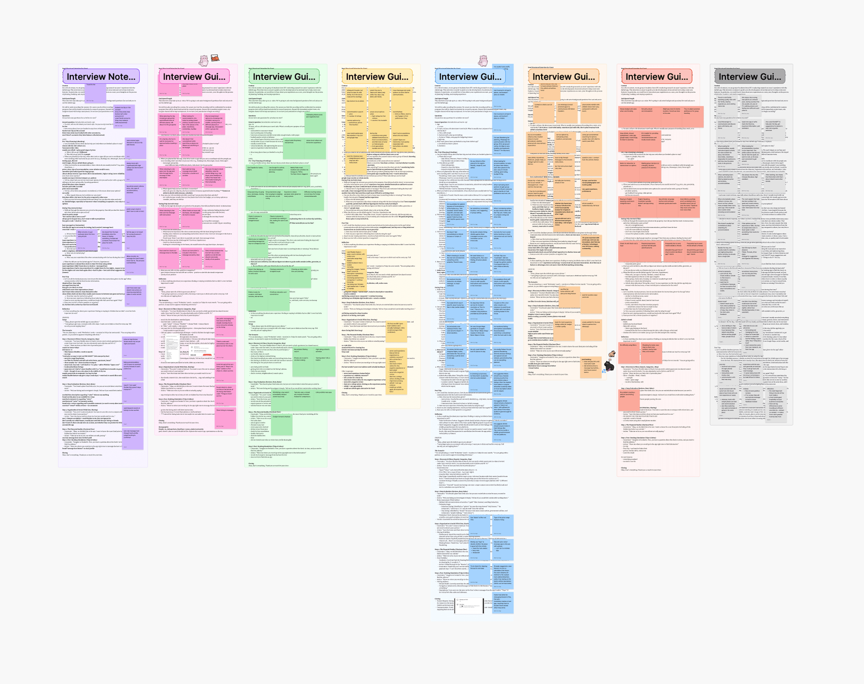
From the interview sessions, we gathered a lot of data from the interview transcripts. While it takes time to separate into small sticky notes by small insights, it really helps for the affinity mapping where it was easy for us to identify an area to focus and where pain points exist.

Research data — after synthesis
Research data — before synthesis
BeforeAfter

Findings

Check-in instruction sits in long message and users report to film video when entering to check for pre-existing damage

Participants scrolled through long house manuals and chat threads just to find a door code or wifi password. The in-app chat worked for messaging but not for urgent lookups, leaving guests to reread and forward instructions on their own.

Planning that leads to booking doesn't happen in Airbnb.

Every group coordinated across multiple apps, with one person carrying all the links, opinions, and logistics. Group decisions were slow and needed full agreement, and too many options made it hard to commit.


Persona

Developed personas for 2 different types of traveler

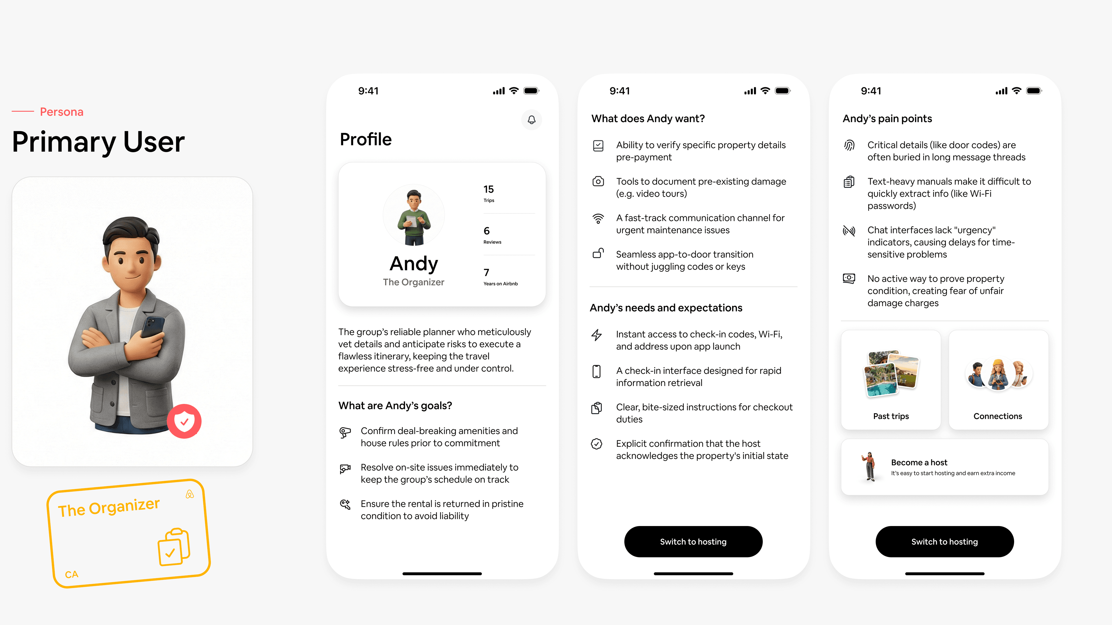
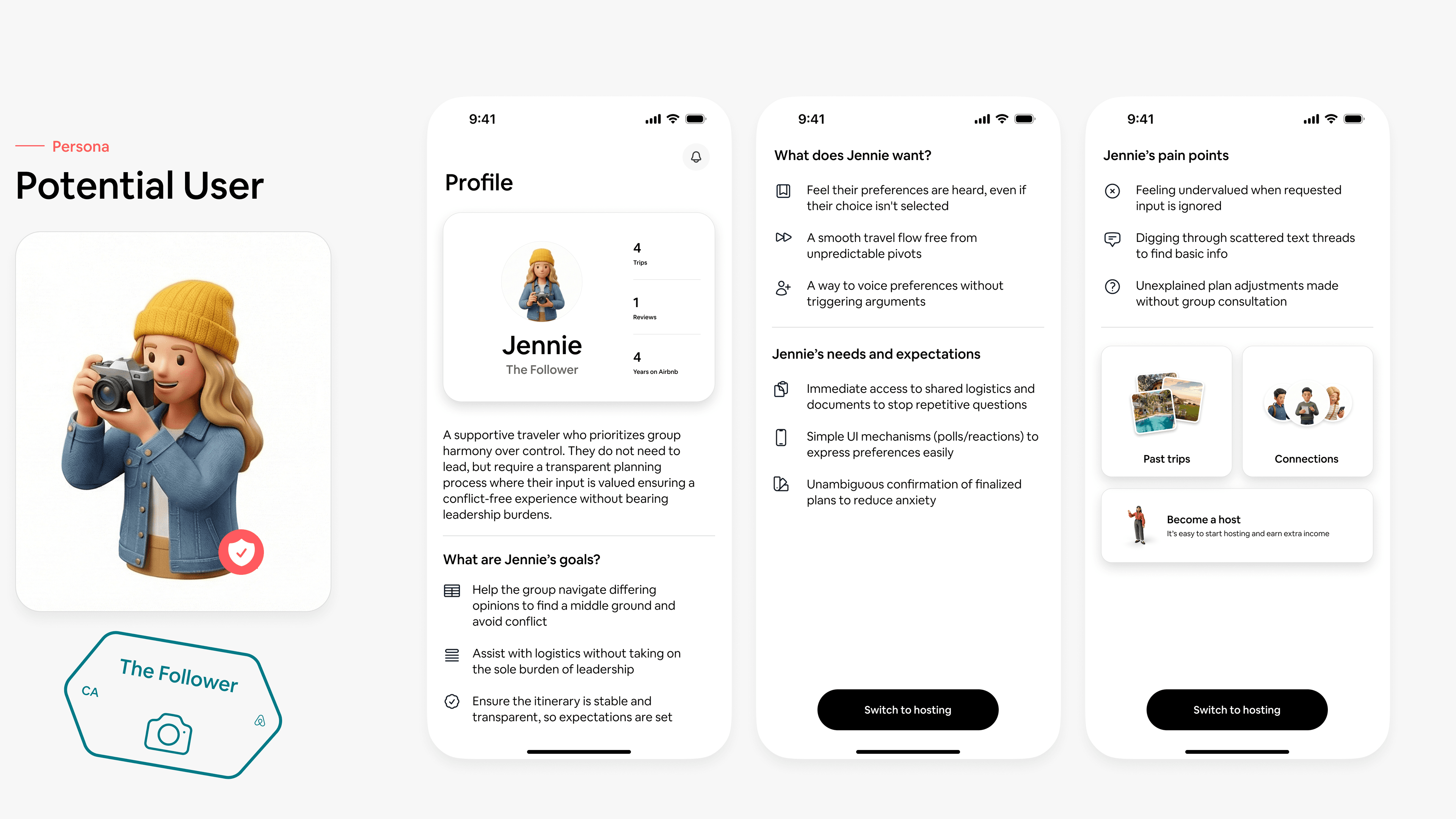
Next, we developed 2 personas to keep us aligned on who we are designing for. They represent 2 distinct groups: one who plans and one who follows. Each role has different needs in the app.

Persona 1 — Andy the organizerPersona 2 — Jennie the follower

Proposed solution 01

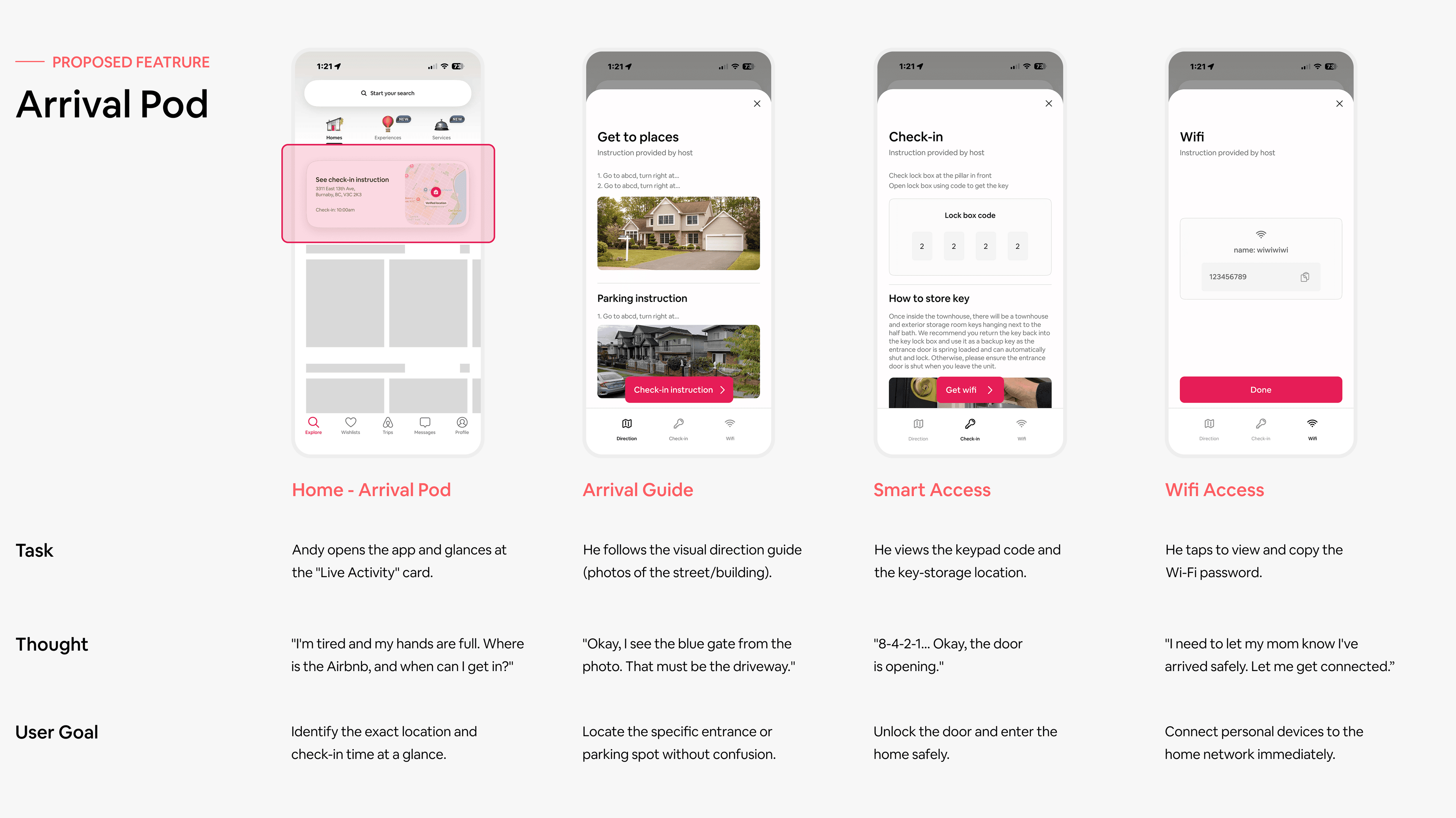
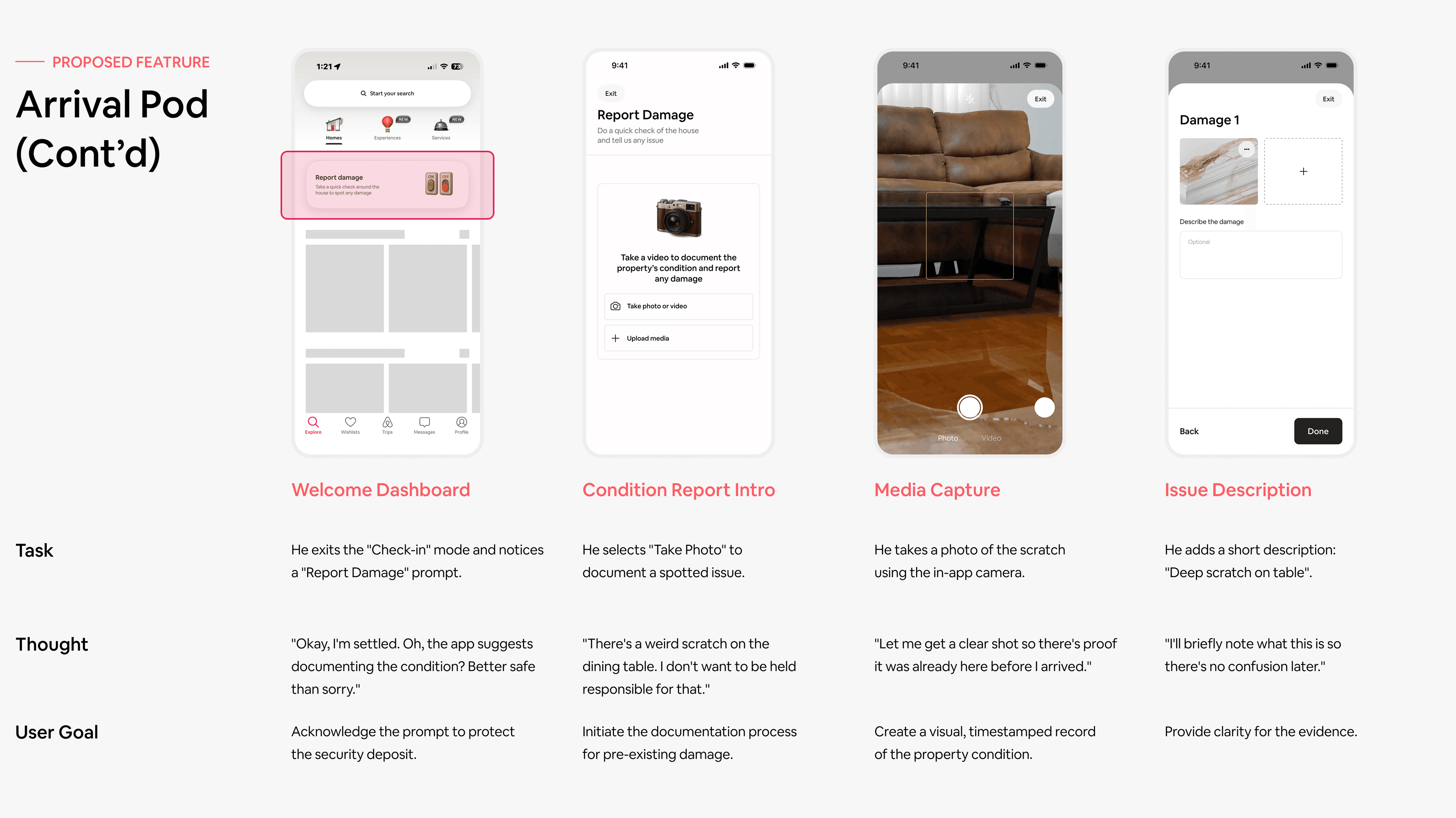
Arrival Pods is for Andy who needs clear info on arrival and proof if something goes wrong.

Andy is the organizer. The moment he arrives, he's also the first one expected to figure out the door code, share the wifi, and make sure nothing goes wrong.

Andy's pain point 1

Critical info is buried in long chat

Guests arrive tired, carrying luggage, navigating an unfamiliar street. Digging through a house manual or scrolling back through a chat thread to find a door code is the last thing they should have to do.

Andy's pain point 2

No place to report existing damage

Guests notice a scratch or broken fixture on entry but have no clear way to document it. Without a record, there's a quiet worry that they'll be blamed and charged for it at checkout.

Arrival Pods — storyboard 1
Arrival Pods — storyboard 2

Proposed solution 02

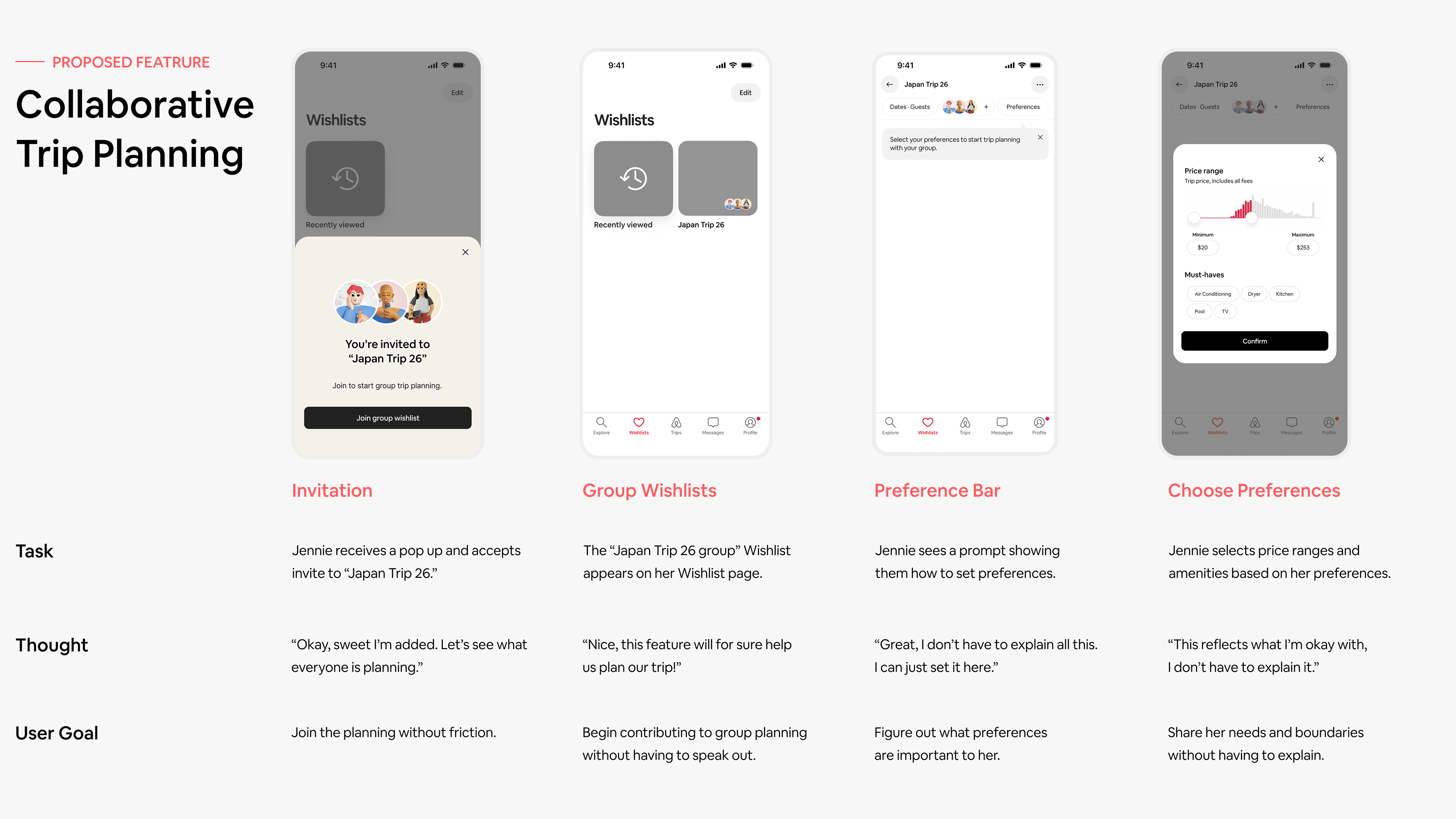
Collaborative planning is for Jennie who needs a way to contribute without losing her voice in the group.

We explored different solutions for each of the personas with low fidelity wireframes. To better share ideas among the team, each solution is fully established in a storyboard to demonstrate how users would interact or how it would be applied in scenarios.

Jennie's pain point

No structured way to contribute in group planning

In group trip planning, Jennie often feels unsure when and how to contribute. Decisions happen across group chats where preferences are voiced unevenly, making it hard to tell what the group actually agrees on. To avoid conflict, she stays quiet or repeats herself, relying on others to interpret her input.

Collaborative planning — storyboard 1
Collaborative planning — storyboard 2

Final solution

Collaborative Planning was chosen because it solved every pain point without forcing a rigid user flow.

To decide, we evaluated each solution against four questions: does it fully solve the pain points, does the interaction make sense for the user, does it create friction, and does it align with Airbnb's guiding principles.

By recognizing that Arrival Pods has a lot of moving parts through different stages such as check-in, check-out, and report damage, it would force users to lock in a defined flow which is not always the case. We decided to move forward with Collaborative Planning because it helps groups reach a decision without leaving the app.


Prototype walkthrough

Final prototype is built with interactions that feel native with the app.

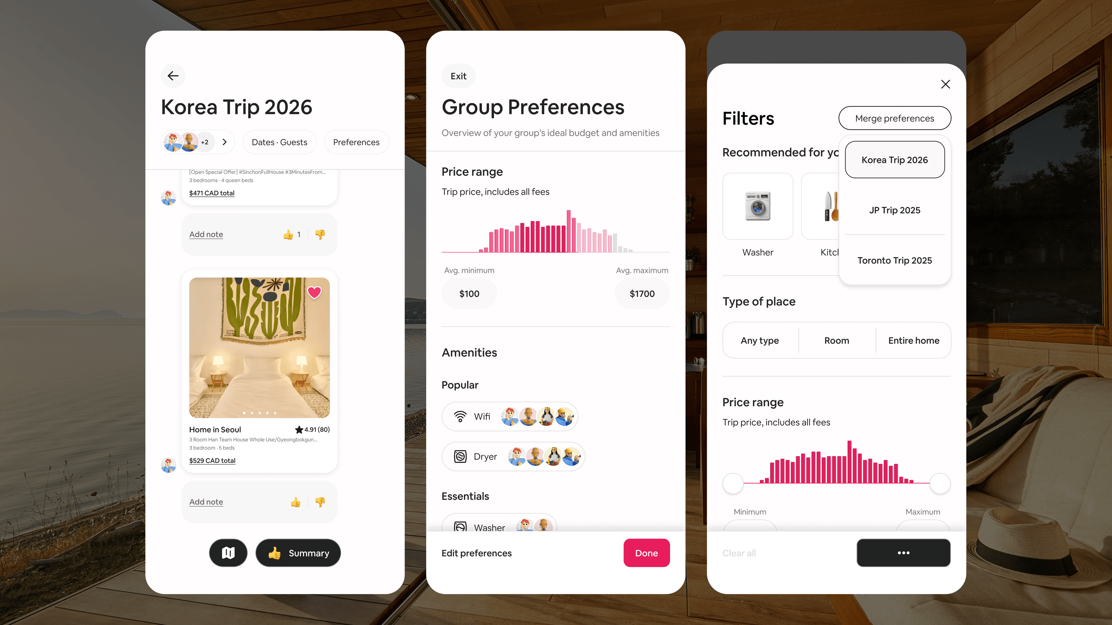
Following Jennie, a group member, through the flow from invitation to decision.

01 — Join the wishlist

Jennie accepts an invitation to the "Korea Trip 2026" wishlist. Onboarding nudges her to set preferences before browsing.

02 — Set preferences

She picks a budget range and her must-have amenities. The app folds her input into the group's aggregated preferences, so she does not need to repeat it in a group chat.

03 — Browse with the group's filters applied

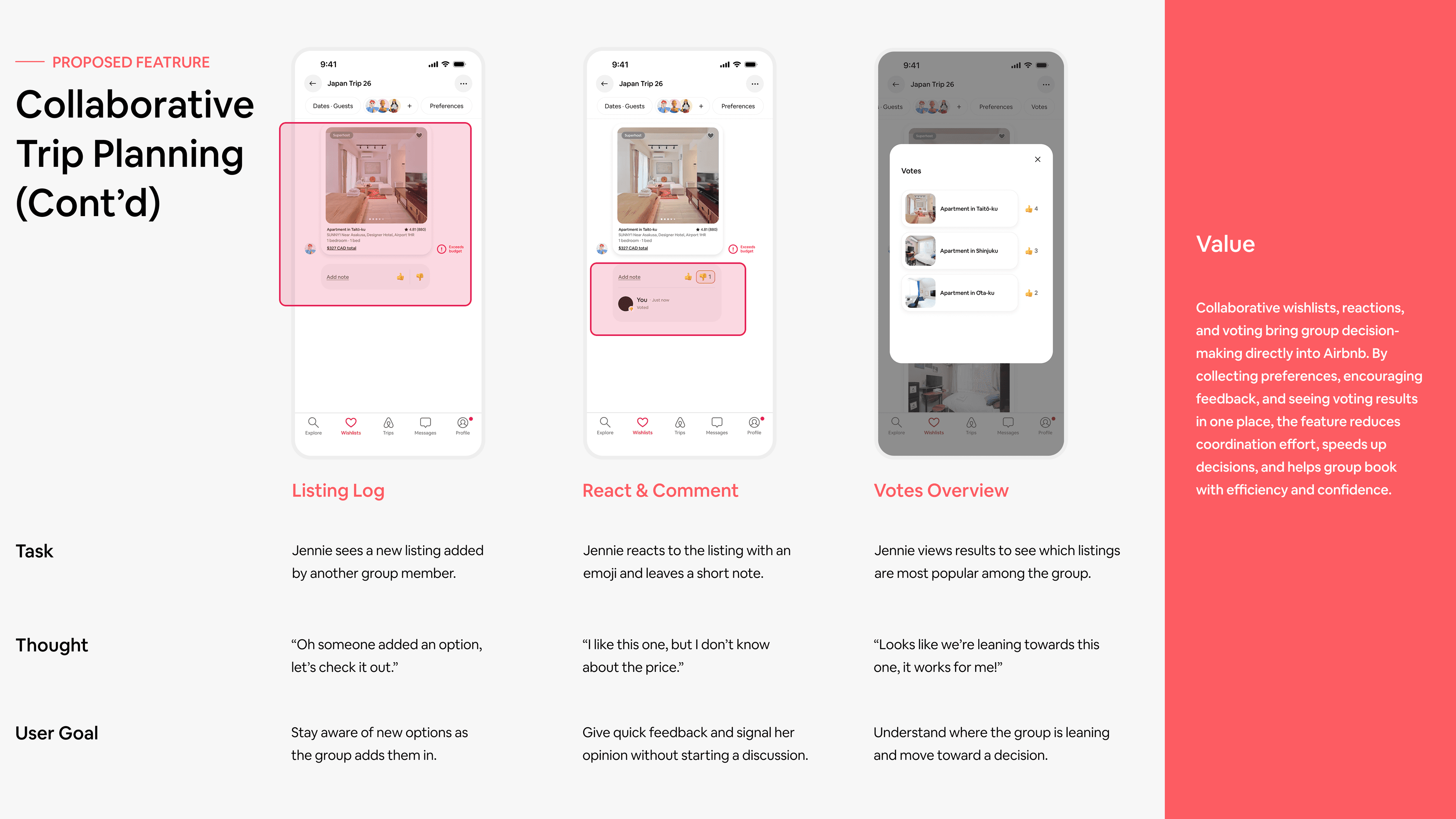
On Explore, Jennie applies the merged group preferences to her search and adds a listing to the wishlist. She can see immediately which listings carry soft warnings.

04 — See where the group is leaning

Jennie opens the Summary to see every saved listing ranked by reactions. The group's favourite is at the top. She and the rest of the group can move toward booking without a separate conversation.


Result

User testing shows positive feedback about how it made group consensus visible without a separate conversation.

3 participants tested the full flow from joining a wishlist to reviewing the summary. All three completed every step without prompting, and feedback pointed to the summary screen as where the experience came together.

Group chat style with the summary allows people to view everything all at once. They don't have to discuss and just look at it themselves. It would reduce a lot more back and forth communication with a third party app.

User testing participant


Learning

The storyboard is where good ideas get tested.

Building out wireframes and storyboards early helped us catch friction before we were too invested to change direction. Andy's solution had real potential in ideation, but fleshing out the full storyboard exposed two problems: prompting users to photograph the space raised privacy concerns, and the flow required too many steps for guests who just want to check in and enjoy their trip outside the app.