Increasing Feature Discovery for Hootsuite
During my internship, I designed a homepage feature that helps Hootsuite users discover the posting options available across their social channels. The project ended with a full handoff to engineering. I worked as a UX Designer, alongside a mentor, partnered with two PMs, and supported by a Senior UX Designer.
Context
Composer is where Hootsuite users draft their social posts.
Hootsuite is a social media management platform where teams plan, schedule, and publish content across multiple networks. Composer is the workspace inside it where every post actually gets written.
The Product Growth team flagged that one of Composer's most valuable formats was getting lost inside it.

Problem
Many Hootsuite users were posting Instagram Stories without the Hootsuite app.
Instagram Stories had grown into one of the most-used post formats on social media, but Hootsuite users were rarely creating them inside the app. The reason was that the Story option sat 4 steps inside the Composer, hidden behind a nested dropdown. Users had to know where to look.
For experienced users, this was enough friction on every Story to make posting directly through Instagram the faster choice. For new users, it was a discovery problem. It only shows when they reach the Composer.
How might I surface Stories and Reels right from the start, closing the gap between discovery and activation?

Solution
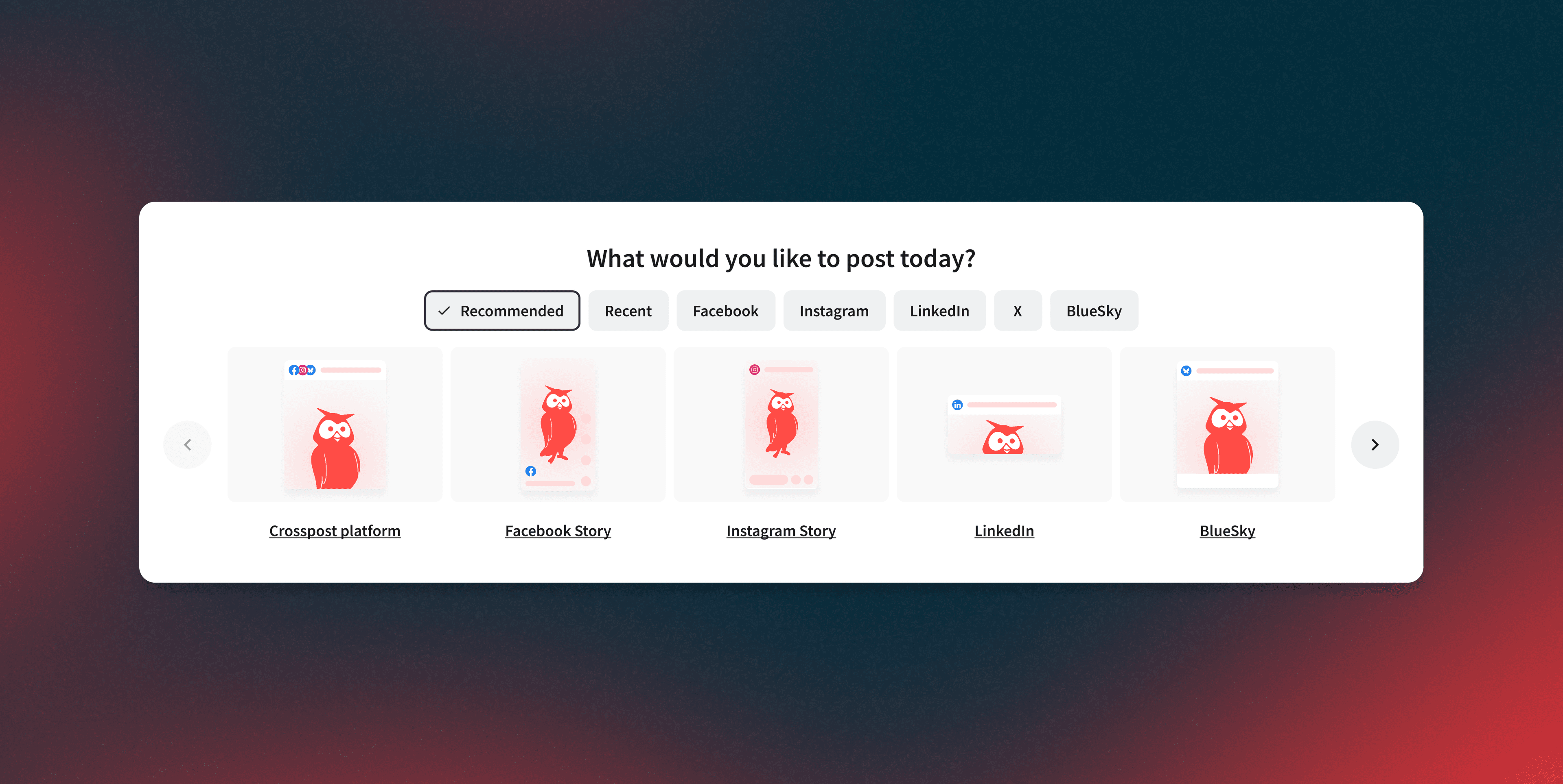
A homepage widget that puts formats in front of users before they go looking.
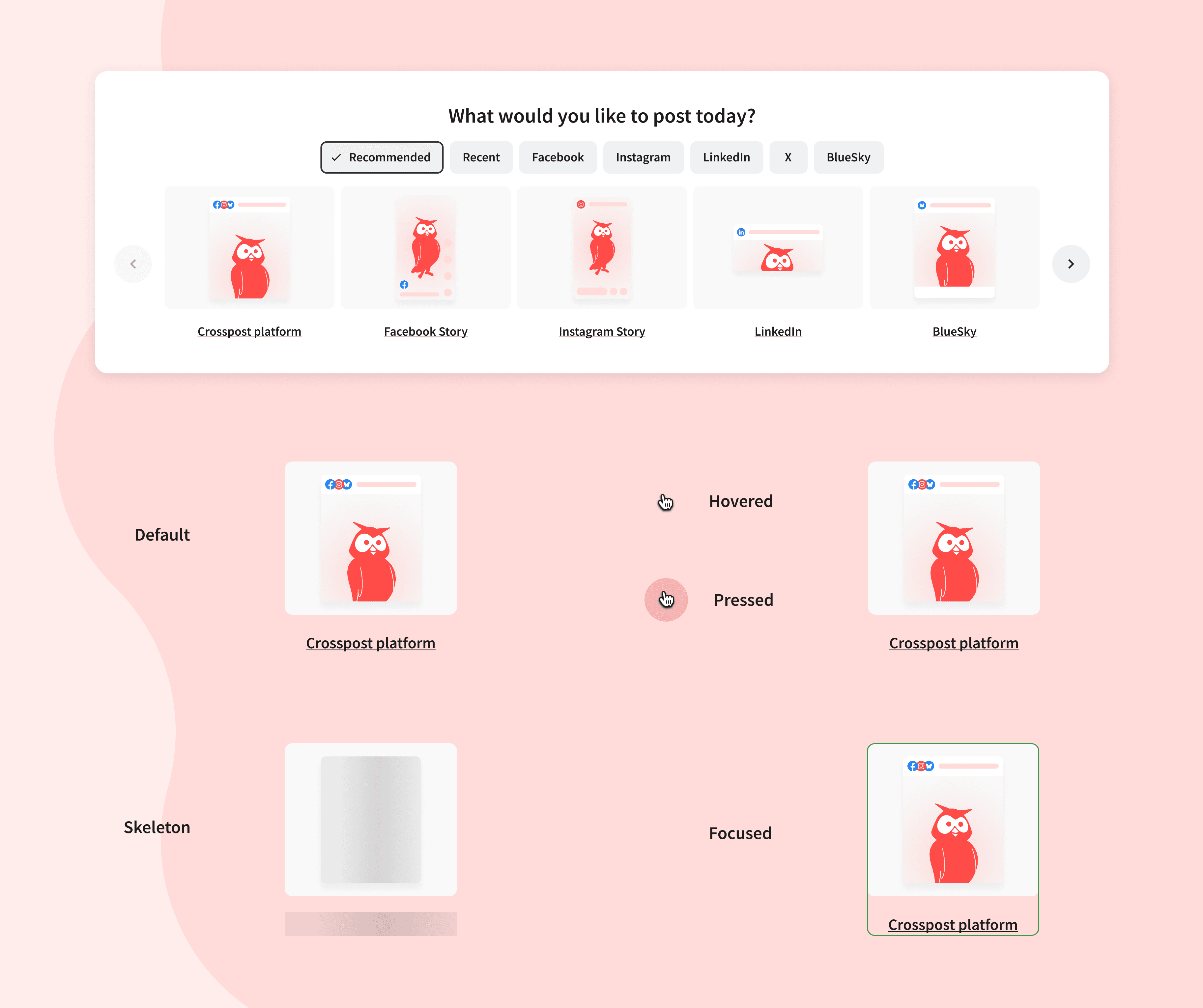
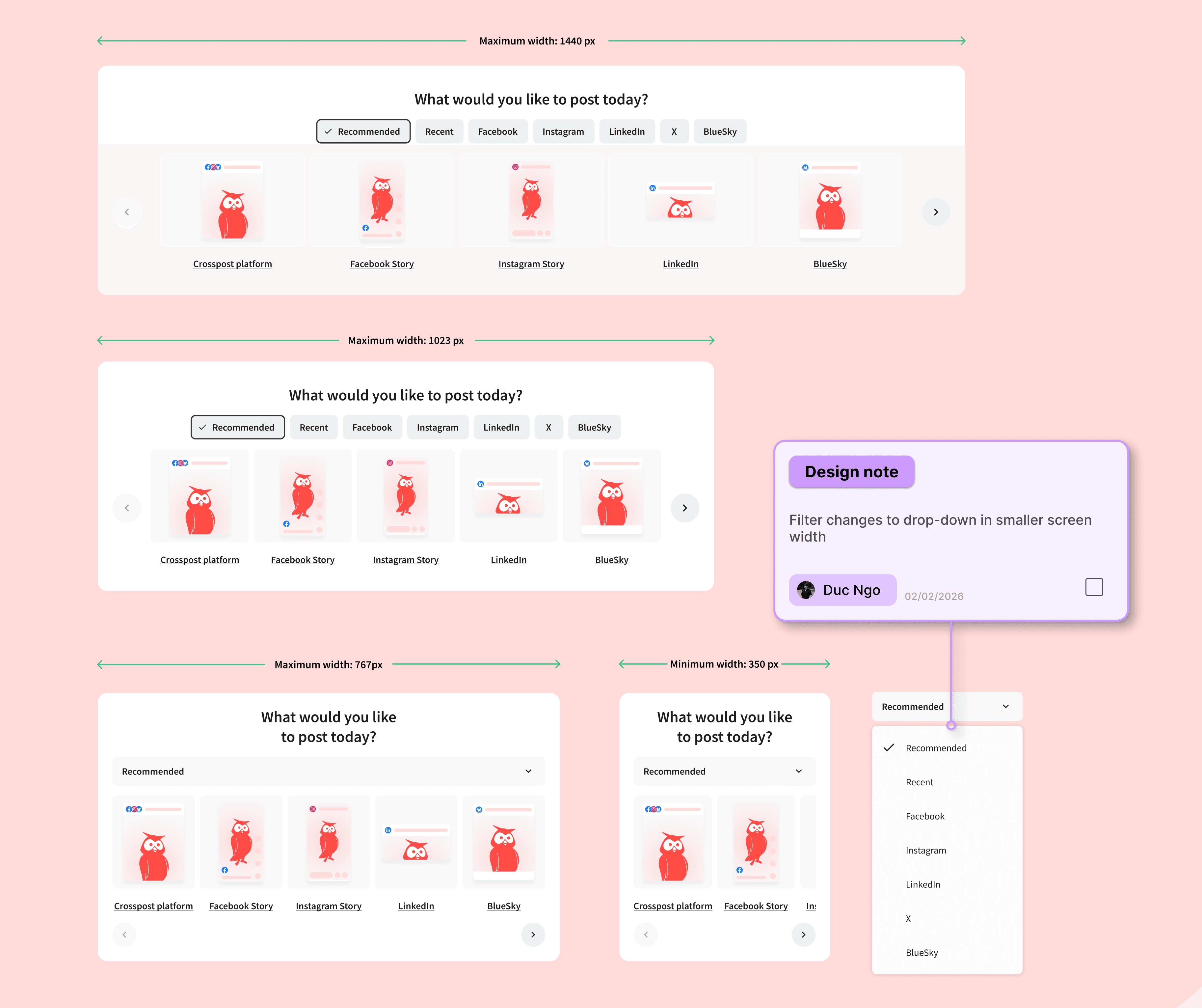
The intent was to put discovery before search. Users shouldn't need to know what's possible before they can find it, especially newer users still learning what Hootsuite can do. So I designed a single-row carousel that meets users the moment they land on the dashboard. Every post format is visible upfront. Stories, Reels, Cross-Post, and the rest of the network options scroll into view through a Recommended filter that defaults to five at a time, keeping the rest of the dashboard intact.
For handoff, I extended the Hootsuite design system with a new button component, mapped every state including a hover micro-animation, and documented card flows, responsive specs, and accessibility landmarks so the team could extend the widget without breaking it.
Learning
I learned how a cross-functional team sharpens the design.
Working closely with PMs helped me understand the business goals and user needs at the same time. Having a mentor got me onboarded with the system and product early on. Exchanging feedback with the team along the way shaped how I framed the solution and brought the final outcome together.